Inspirational Book, JPG
Japan Graphics, Volume 1
To put it bluntly I love this book and it's contents. Coming across this in the university library was like striking gold to me. What caught my eye when I was searching for some inspirational books was the way the book stood out among the rest, the book cover has a very minimal design to it but the cover itself was made out of this textured plastic that reminds me of bubble wrap. The front of the book has a piece of foam shaped like a page or document icon housing the name of the book 'JPG' in a simple pixel font. A great homage to digital design and computing of that time.
 |
| The book is a little bit battered but not too bad for a 15 year old book |
The design work inside is rather appealing to me, there are hundreds of pages covered with Interesting illustrations, I particularly like the designs created by 'Power Graphixx'. Their work has very simple minimal designs that limit to about 2 or 3 colours (excluding white). The use of negative space has always been a personal favourite and Power Graphixx have combined this style with bold contrasting colours creating an impact with their work.
 |
| I find these two designs created by Power Graphixx to be the most appealing. |
Along side the illustrations the book also contains small portions of text at the beginning of each 'chapter' including a brief history about how japan as a country developed since world war 2. It states how Japan was once a defeated nation and until Japan came under american occupation, the modern day citizens of japan have the impression that their nation and culture were 'reset' to recover from the damage of the defeat as soon as possible. The Japanese chose to adapt to western culture and even voluntarily abandon most of their own culture. I found this body of text in the book to be rather fascinating, I don't have much knowledge of nations post war but learning about how quickly japan went through this restoration process after their 'reset' is captivating.
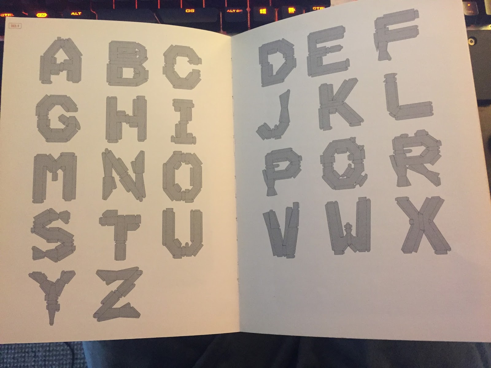
The typography within this book is digital inspired and quite interesting in how the designers have created these type faces, one i like in particular is the 'HAKO (box) font' created by Dainippon Type Organisation. This type face is a 3-dimensional font, when the box is unfolded each letter transforms into another letter, for example, as it's 3-dimensional box font the letter 'K' is formed, but when the letter is unfolded, the net of the box creates the letter 'R'. the typeface has the whole alphabet in net form and each will make a certain letter. However by the looks of it, when the letters are folded into their 3-dimensional forms don't create a full alphabet and also create duplicate letters such as the letter 'U'
 |  |
I find this book to be extremely inspirational and relevant. A lot of my personal design work corresponds with majority of the work showcased within the book. the collection of pixel and futuristic illustrations and typography appeals to me in sense of my cyberpunk aesthetic. As a matter of fact i would like to attempt to replicate some of the design aesthetic displayed in this book.


Comments
Post a Comment